Imagine walking into a store. The lights are flickering, products are scattered, the cashier is nowhere to be found, and the signs don’t make sense. Would you stick around? Probably not.
That’s what many websites are doing to their visitors—only it’s much less obvious in the digital world.
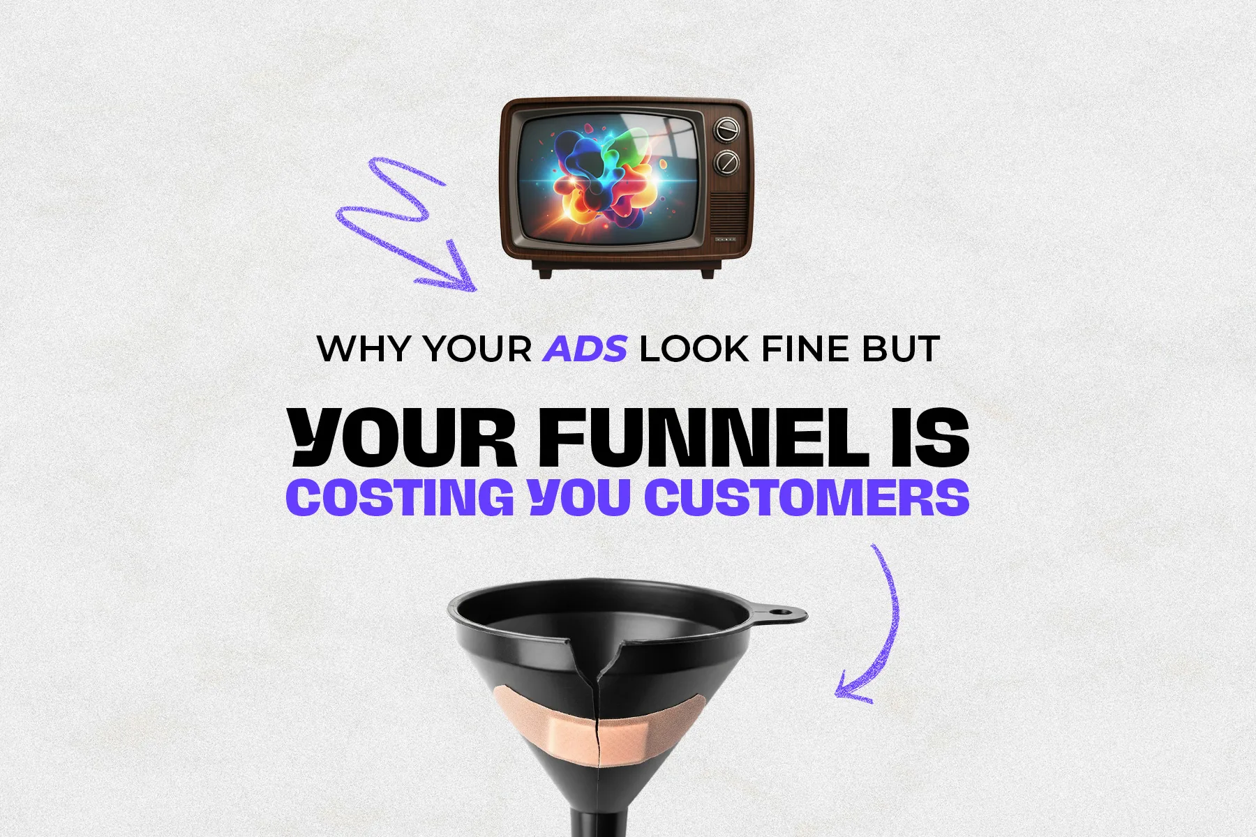
Your website isn’t just a place to show off your brand—it’s where trust is built, decisions are made, and money changes hands. And without realising it, your site might be chasing people away faster than you can bring them in.
Let’s walk through the silent killers of online sales—and how you can finally stop sabotaging your own success.
1. You’re Speaking in Code, Not in Conversation
Too many websites speak like robots trying to impress other robots. You’ll see phrases like “scalable solutions,” “leveraging synergy,” or “cutting-edge frameworks.” But when people land on your site, they’re not looking for buzzwords—they’re looking for help.
Real talk:
A local florist with a beautiful website initially used the tagline, “Delivering floral excellence across urban and suburban regions.” When this was changed to “Beautiful flowers, delivered fresh to your door—same day,” their bounce rate decreased by 27%.
The Fix:
Write as you talk. Talk to your audience like you’d talk to a real person across the counter. Be clear, not clever. Be real, not robotic.
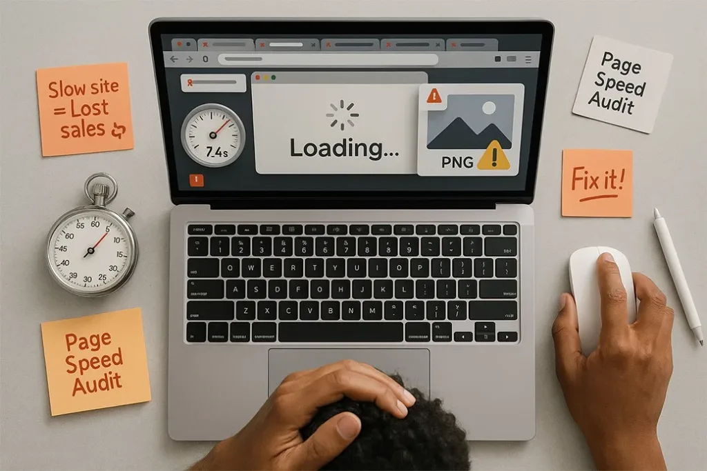
2. Slow Load Times Are Killing Trust Before You Even Say Hello
People are impatient online. If your site takes longer than three seconds to load, visitors might not even make it to your homepage before bouncing.
And here’s what most people don’t realise: speed isn’t just about convenience—it’s about trust. A slow site feels unprofessional and out-of-date. That’s not the vibe you want when someone’s deciding to hand over their credit card.
The Fix:
Compress your images. Clean up unused plugins. Invest in faster hosting. And test your site using free tools like GTMetrix or PageSpeed Insights. Speeding up your site is like cleaning the front window of your shop—it instantly makes your site feel more inviting.
3. You’ve Left People Wondering, “Now What?”
So, your site looks good. That’s great. But does it lead anyone to action?
So many websites show everything—but guide nothing. They pile on options like “Read More,” “Contact Us,” “See Our Story,” “Follow Us,” “Download Brochure,” “Request a Quote,” “Browse Products” … and the visitor’s left thinking, “What am I supposed to do first?”
The Fix:
Pick one primary action per page. Whether it’s “Buy Now,” “Book a Free Call,” or “Start Your Free Trial,” make that call-to-action obvious, friendly, and repeated. Make it so easy they could do it with one thumb.
4. It’s Not Mobile Friendly—And That’s a Dealbreaker
Over half of your visitors are checking you out on a phone. If your website doesn’t work well on mobile, it’s like hanging a “Closed” sign on your digital storefront.
A Sydney-based gym whose mobile site featured overlapping text, impossible-to-click buttons, and a booking form that failed to load on iPhones. After a mobile-focused redesign, class bookings doubled within a fortnight.
The Fix:
Visit your site from your own phone. Scroll. Tap. Try to buy something. If anything’s frustrating, fix it. And don’t rely on how it “should” look—experience it like a customer would.
5. You’re Talking All About You (Instead of Solving Their Problem)
This one’s a biggie. So many businesses build websites like resumes— “We were founded in 1997,” “We are passionate about excellence,” “We believe in innovation.”
The truth? Your visitor doesn’t care.
They’re not looking for your history. They’re looking for a solution.
The Fix:
Make it about them. Instead of saying, “We create websites,” say, “We help small business owners turn their websites into sales machines.” Talk about the results they want to see. Not your process—their payoff.
6. You’re Hiding Your Prices or Making Them Confusing
Here’s a simple truth: people want to know what it costs. If they can’t find your prices or understand your packages, they won’t call to ask—they’ll just leave.
A lesson learned:
A Brisbane-based photographer was getting traffic but no leads. Her packages weren’t listed, thinking it would “encourage inquiries.” But all it did was create friction. By adding clear pricing and package details, leads nearly tripled in the next 30 days.
The Fix:
Be transparent. You don’t need to show every detail but give a ballpark. Clarity builds confidence.
7. You’re Not Giving Visitors a Reason to Come Back
Not everyone buys on their first visit. But if you’re not collecting emails or retargeting them somehow, you’re throwing away warm leads.
A real-world example:
A Melbourne-based nutrition coach gave away a simple freebie— “5 Healthy Meals for Busy Parents”—in exchange for email signups. Those emails became a nurturing tool: weekly tips, success stories, and offers. Her online program sales grew steadily from that one change.
The Fix:
Offer value in exchange for contact. Create a simple downloadable guide, a quiz, or a first-time discount. Start the conversation. Stay top-of-mind.
8. No Trust Builders = No Sales
In the digital world, trust is everything. If someone doesn’t know you, they’ll scan your site for signs that say, “You can trust me.”
If you don’t show reviews, testimonials, case studies, guarantees, or even your face—they might bounce out of uncertainty.
The Fix:
- Add real testimonials (with names and photos)
- Display social proof (e.g. “Trusted by 500+ Aussie businesses”)
- Include contact info that shows you’re real and reachable
- Use secure checkout badges and refund policies
Final Thought: Your Website Isn’t Just a Website—It’s Your First Impression
If your website were a salesperson, would you keep them on the team?
Are they clear, confident, helpful, and approachable—or confusing, slow, and hard to reach?
You don’t always need a full rebuild. Often, it’s the small tweaks—like faster load times, clearer messaging, or better mobile layout—that make the biggest difference. However, it’s important to be truthful with yourself.
Because in 2025, when attention spans are shrinking and competition is rising, your website must earn every sale it makes.
Not sure how it stacks up? Start by running a quick check with Google’s Mobile-Friendly Test or a responsive design tool. It’s a simple step, but it can reveal powerful insights.
And if you’re looking for a fresh pair of eyes, the team at Shopa Marketing is always here to help—whether it’s a quick audit or a strategic refresh.
Make your website your strongest asset—not your weakest link.